
Project managers juggle a variety of processes, programs, and people. With so many variables interacting and affecting the trajectory of a project, it can be difficult to understand how each element works together and influences outcomes.
Matrix diagrams help project managers visualize and evaluate those complex relationships so they can make better decisions and keep projects on track.
A matrix chart or diagram is a project management and planning tool used to analyze and understand the relationships between data sets.
Matrix charts compare two or more groups of elements or elements within a single group. They help project managers identify how information is related as well as the strength of those relationships.
The types of information you can analyze in a matrix includes:
The relationships between items are indicated by a number or symbol in the cell where each pair of elements intersect.
The matrix shape you use will depend on the number of elements you want to compare. There are five common matrix diagrams: L-shaped, Y-shaped, C-shaped, T-shaped, and X-shaped.
Matrix diagrams are an effective tool for visualizing complex (many-to-many) relationships. They help project managers identify the different ways elements interact and depend on one another in order to make better decisions, solve problems, and improve processes.
By putting groups of elements into a matrix chart of rows and columns, project managers can more easily visualize the relationship between objectives, factors, and causes within the organization they are observing.
For example, when comparing two lists with a simple one-to-one relationship, you can easily depict the relationships in a straightforward side-by-side table. However, if some of the elements in the list are related to more than one other element, the side-by-side table visualization is inadequate. The connections between each element become tangled and difficult to track.
That’s where a matrix diagram comes in.
A matrix diagram charts those complex relationships clearly by documenting the two (or more) lists as rows and columns and mapping their relationships within the cells.
You can use matrix diagrams whenever you need to identify and assess the relationships between two or more sets of data.
Common applications of matrix analysis include:
Matrix diagrams are especially helpful when trying to understand causal relationships or conducting quality function deployment (QFD) analysis.
There are five basic types of matrix charts. Below we cover what each type is and when to use it.
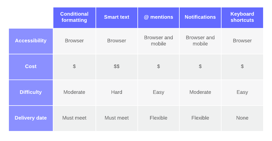
What is it: The L-shaped chart is the simplest and most common matrix diagram. It compares two sets of data in a two-dimensional table.
One data set is represented on the left-hand column and it is compared against the second data set in the top row of the table. Numbers or symbols notate the relationship between pairs in the intersecting cells.
You can also tally the scores and note the totals on the end rows to help rank or prioritize items within the chart.
When to use it: Use the L-shaped diagram when you need to compare two groups of items or one group to itself. The example below shows different features and their corresponding costs and requirements.

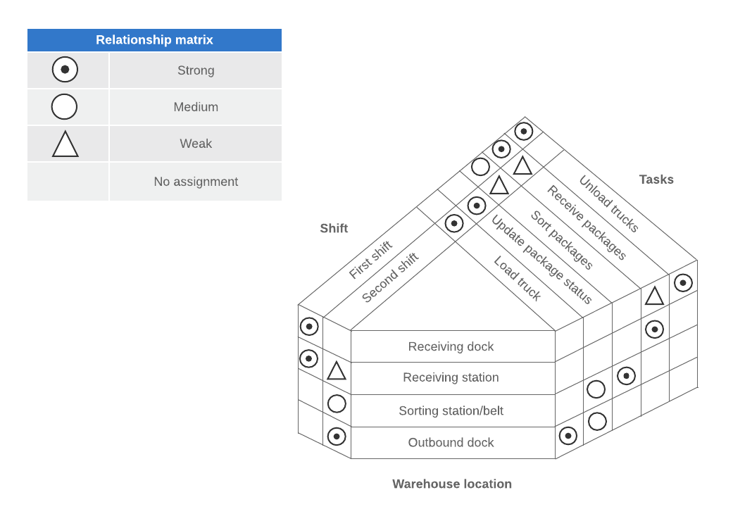
What is it: The Y-shaped diagram relates three groups of items that are all related to each other in a circular flow (i.e., A ← → B← →C← →A). These relationships are depicted in a circular diagram.
When to use it: Use the Y-shaped matrix when you need to compare three tightly related groups. It can also be used as a practical simplification of the C-shaped matrix. The example below shows the relationships between employee shifts, tasks, and warehouse locations.
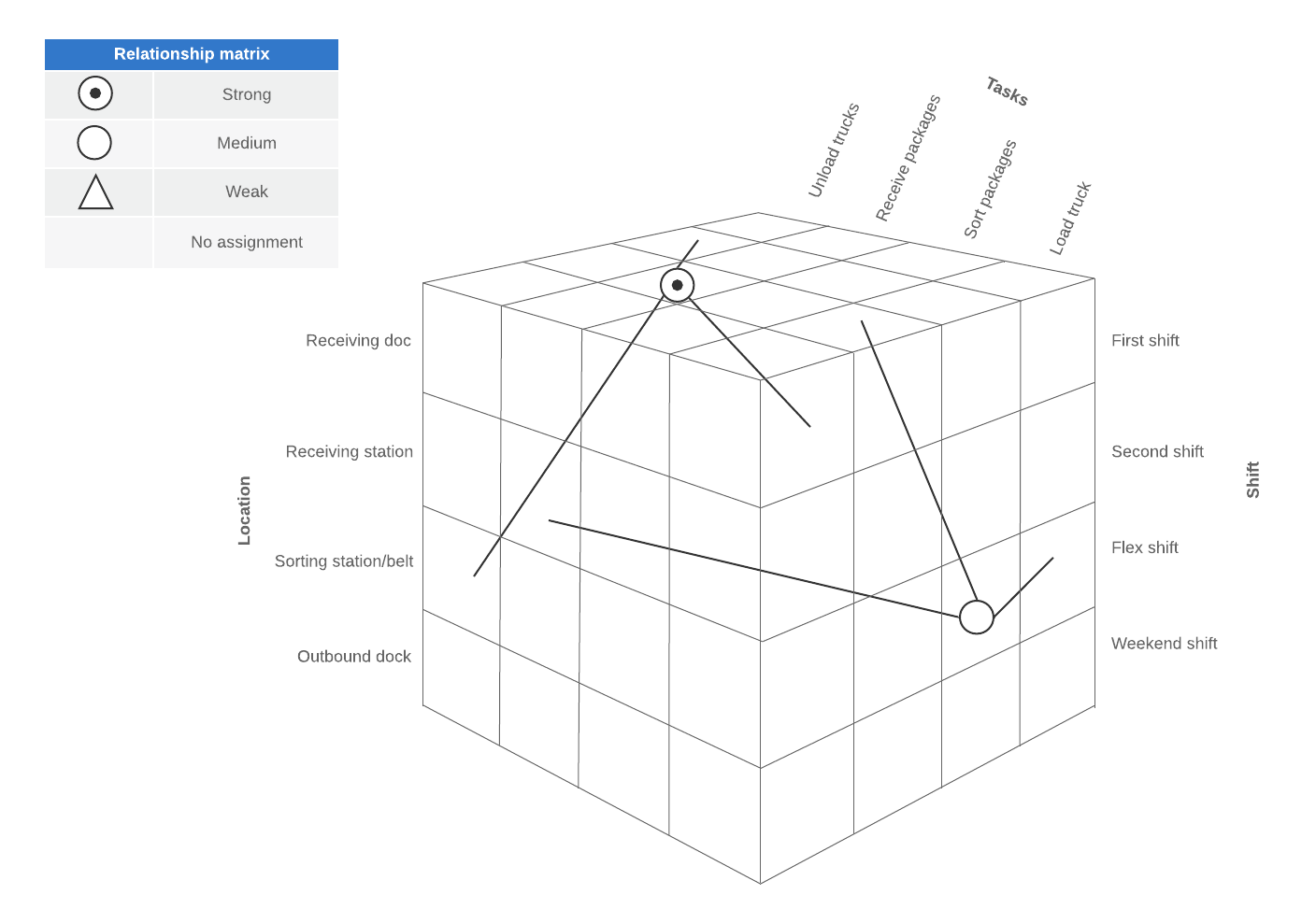
What is it: A C-shaped diagram, like a Y-shaped matrix, compares three sets of data. However, the C-shaped matrix relates the three groups simultaneously in a three-dimensional cube diagram.
When to use it: Use the C-shaped matrix when you need to compare three groups simultaneously (e.g. the people, products, and processes in a factory).
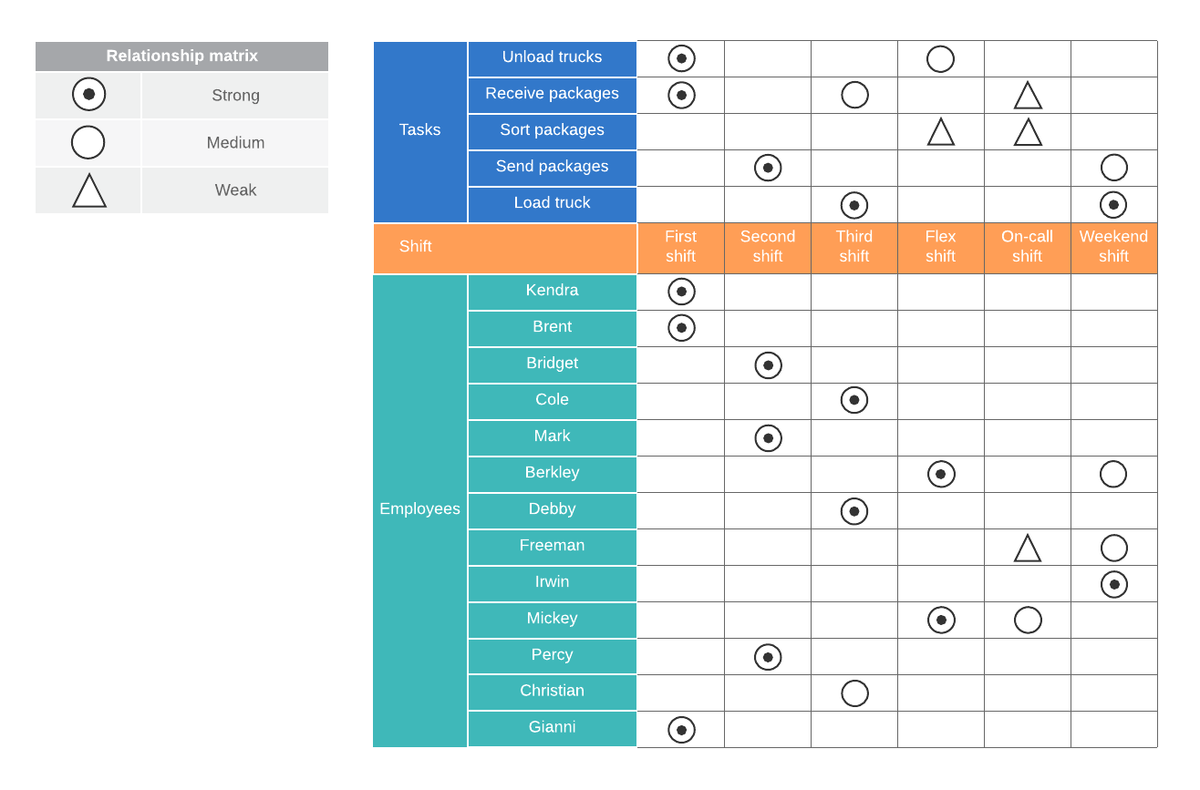
What is it: A T-shaped diagram is essentially two L-shaped matrices joined by a single list. This matrix lets you compare one list (the center “pole” of the T) to two other groups. It is helpful when you have two distinct sets of questions about a core group.
When to use it: Use the T-shaped matrix when you need to compare two groups that are related to one primary list (but not to each other). For instance, in the example below, work shifts are related to required tasks and the employees that work at that location.
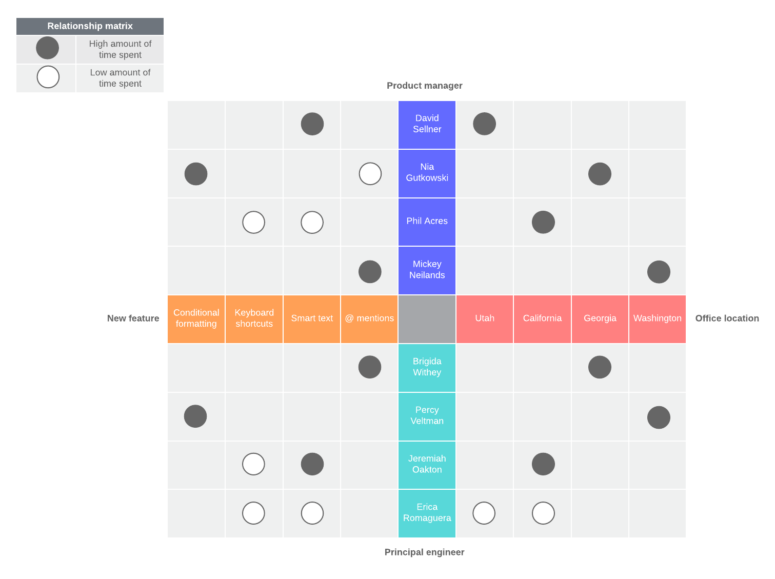
What is it: The X-shaped matrix is useful for comparing two pairs of complementary lists. It is similar to the T-shaped diagram but it extends the T-shaped chart to include an additional set of data.
The result is a diagram with an X- and Y-axis forming a cross or “X” shape that compares four total groups of data. In this relationship matrix, each axis is related to the groups immediately adjacent to it, but not the group across from it. For instance, in the example below, office locations are related to the product managers and principal engineers, but not to the new features.
When to use it: Use the X-shaped diagram when you need to compare four groups of items.
Follow these steps to begin conducting a matrix analysis.
Before you begin building your diagram, you need to define your objective for the exercise. What information or insights are you trying to glean from your analysis?
Whether you are simply exploring relationships or want to achieve something more concrete (such as making an important project decision), clearly identify that goal from the start. This will guide you as you collect data, select your supporting team, and choose a matrix type.
Next, you need to select who you want on your team. Choose team members who have the time and expertise best suited to achieving your stated objective. These people should understand the data sets and be able to inter-relate the lists.
Keep in mind that matrix analysis can be a time-consuming project, so it’s important that your team can commit to the assignment.
Once you have your team assembled, you can begin identifying and collecting the data you will be analyzing. Your team can help you determine what data should be compared and is most important for providing accurate and meaningful insights.
Be careful during this process to avoid any bias that could skew your results.
The matrix you use to analyze the data depends on what your goal is and the types of data you are comparing. (See the section above to determine which type of matrix diagram best suits your data sets.)
Determine how you will compare the data and what symbols you will use to notate the matrix.
For instance, will you be comparing the relationships based on strength (i.e., strong, medium, weak) or some other factor like influence or responsibility? How will you mark those relationships on the matrix?
This is the core step of matrix analysis. Take your time and methodically work through each cell, comparing each set of relationships carefully based on the rules you outlined in Step 5.
Make sure there is consensus on each decision and document any relevant discussion surrounding the analysis. Documentation can help you as you review your choices and finalize the chart.
Once your analysis is complete, you can review the matrix to evaluate and draw conclusions based on the results.
While the process of matrix analysis can be time-consuming, the investment is well worth the effort. Matrix diagrams help you understand the factors, variables, and relationships influencing your project or business—so you can make better decisions.

Get started in Lucidchart by exploring hundreds of our free templates that make it easy to do your best work.
Lucidchart, a cloud-based intelligent diagramming application, is a core component of Lucid Software's Visual Collaboration Suite. This intuitive, cloud-based solution empowers teams to collaborate in real-time to build flowcharts, mockups, UML diagrams, customer journey maps, and more. Lucidchart propels teams forward to build the future faster. Lucid is proud to serve top businesses around the world, including customers such as Google, GE, and NBC Universal, and 99% of the Fortune 500. Lucid partners with industry leaders, including Google, Atlassian, and Microsoft. Since its founding, Lucid has received numerous awards for its products, business, and workplace culture. For more information, visit lucidchart.com.